Desert modern is one of those design styles that looks simple from the outside and turns out to be one of the most technically demanding aesthetics to execute well. The restraint required is real. Every material, every finish, every piece of furniture has to earn its place, because in a space defined by warm neutrals and natural texture, there is nowhere to hide a bad decision. This home tour is a walk through one of the projects our Scottsdale interior design firm has delivered, not because it is the largest we have done, but because every element is exactly where it should be.
The home sits in North Scottsdale, positioned to capture views of the desert preserve to the east and the McDowell Mountains to the north. The architecture was already strong when we came on board. Our job was to build an interior that responded to the Sonoran Desert landscape rather than competing with it. That orientation guided every decision from the flooring to the furniture scale to the window treatment approach. Scottsdale's particular quality of light, the way it moves from warm morning gold to a flatter afternoon diffusion, is not something most out-of-market designers plan around. We do.
The Foundation: Material Palette and Why It Matters
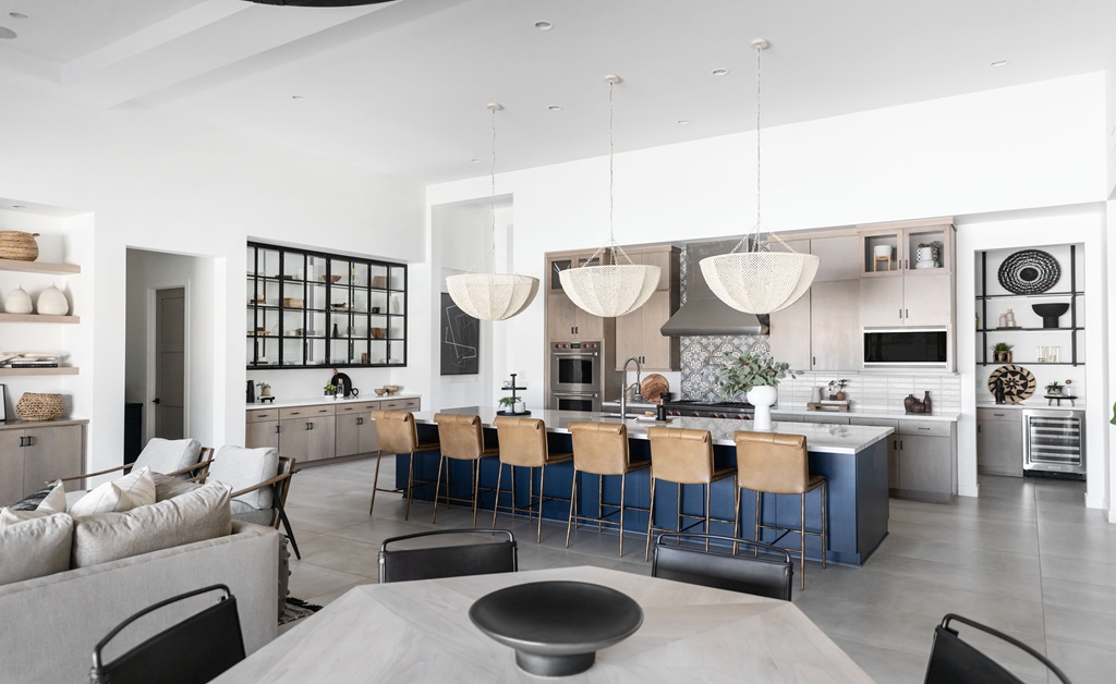
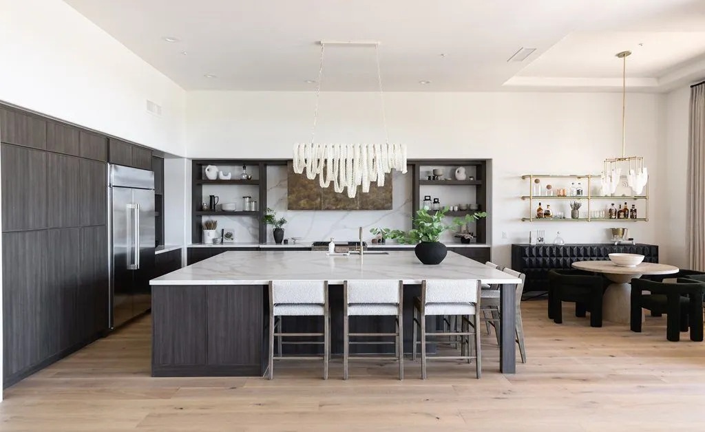
We started, as we always do, with the material palette. Desert modern lives or dies on this decision. The palette here was built on three anchors: a warm limestone-look large-format porcelain for the floors, a riven natural stone for the kitchen island and primary bath, and whitewashed white oak for the cabinetry and custom millwork. Everything else, the soft goods, the lighting, the hardware, was selected to support those three elements rather than introduce new visual variables.
The porcelain runs continuously from the entry through the main living areas and into the primary suite, with only a threshold shift to mark the bedroom boundary. That continuity does a lot of work spatially. It keeps the eye moving and makes the square footage read larger than it is. More importantly, it responds to how the Arizona light moves through the house across the day. In the morning, the eastern exposure warms the stone tones. By afternoon, the diffused western light flattens everything into something quieter. Both readings are beautiful, and they were both considered during selection.
The white oak cabinetry was milled with a tight linear grain and finished in a wire-brushed whitewash that gives it texture without heaviness. I specified it flat-front with integrated hardware pulls, which keeps the surface clean and lets the material speak for itself. This is the kind of detail that separates a well-executed desert modern kitchen in Scottsdale from one that reads as a generic contemporary renovation.
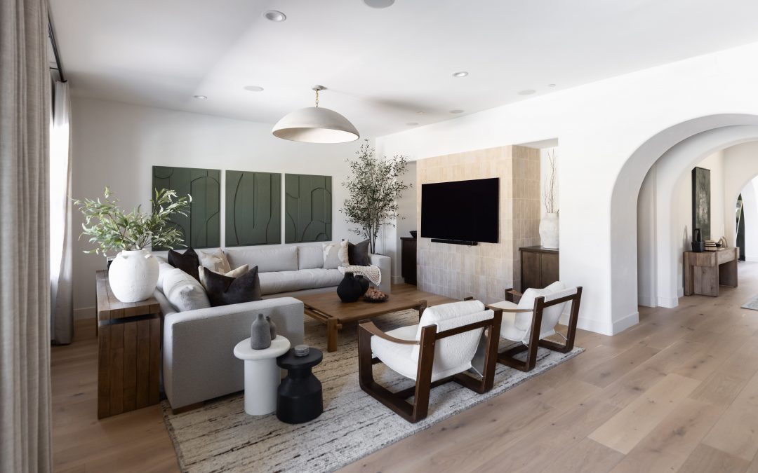
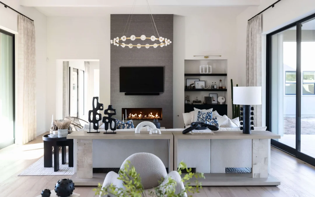
Furniture Scale and the Desert Modern Living Room
One of the most common mistakes I see in attempts at this style is furniture that is either too small for the architecture or too busy in its forms. Desert modern architecture in the Scottsdale and Paradise Valley area tends toward generous ceiling heights and open volumes. Furniture needs to be proportional to that scale. In this living room, we worked with a large sectional in a bouclé fabric the color of dried desert grass, anchored by a custom concrete-top coffee table and flanked by two linen-upholstered accent chairs.
The sectional is large enough to fill the room without crowding it. The concrete table has weight and permanence without visual heaviness. The chairs introduce a secondary texture that plays against the bouclé. None of it is precious or fragile, which matters in a home that is actually lived in. Desert modern in Arizona should feel grounded and comfortable, not like a furniture showroom.
Lighting in this space is a combination of a custom woven pendant over the dining table, recessed lighting on a dimmer system, and a series of sculptural ceramic table lamps. The woven pendant is the one piece with real visual presence. Everything else stays quiet. That hierarchy is intentional. In a room with strong natural light and strong views across the Scottsdale desert, you do not want the artificial lighting competing for attention.
The Primary Suite: Where the Style Lands Best
The primary suite is where this aesthetic has its fullest expression. The bedroom has floor-to-ceiling windows on two walls, which means the North Scottsdale desert preserve is always present. The material palette carries through from the main living areas, with the same oak millwork on a custom built-in wardrobe wall and the same stone on the fireplace surround. The bed is a low-profile platform design in natural linen with a solid headboard, no tufting, no nailheads, just form and fabric.
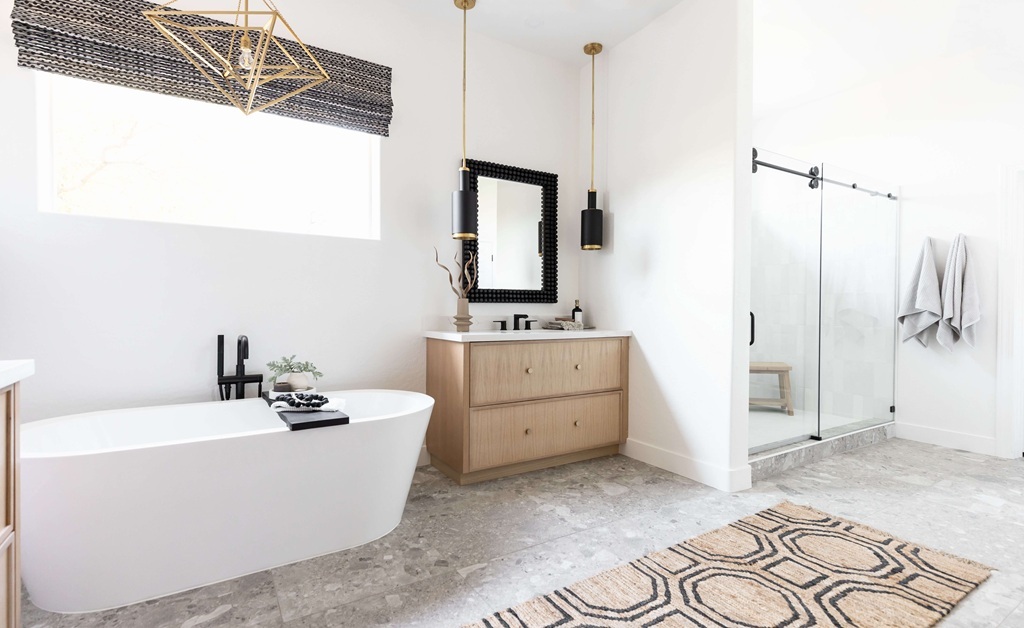
The primary bath is a full gut renovation. We opened the shower to curbless entry, installed a floating double vanity in the same wire-brushed oak, and used a book-matched slab of natural travertine on the shower walls and floor. Travertine is a material that performs particularly well in the Arizona climate: it handles temperature variation, reads warm under the desert light, and gets better looking with age. The result reads completely differently from the sleek surfaces you find in a conventional luxury bath, and that difference is the point. If you are thinking through a similar renovation in Scottsdale or Paradise Valley, our guide on what to expect during a Scottsdale remodel walks through the full process in detail.
What This Project Demonstrates About Desert Modern Done Right
The homes I see that attempt desert modern and fall short tend to share a few characteristics. The material palette is too varied. The furniture scale is inconsistent. The connection to the Sonoran Desert landscape is an afterthought rather than the organizing principle. Getting the style right in a Scottsdale home requires making those decisions in sequence and holding them consistently across every room.
This project worked because the architecture gave us a strong starting point and the clients were aligned on the vision from the first conversation. They understood that restraint was the point, that the home would get its richness from material quality and spatial clarity rather than from layering in more elements. That alignment made every decision easier and the result more coherent.
If you are interested in what this kind of project involves from a design and construction standpoint, our services page outlines how we approach full-scope residential projects in Scottsdale, Paradise Valley, and the broader Phoenix metro. And if budget is part of your planning process, our 2026 remodel cost guide gives a realistic picture of what luxury-tier work in the Scottsdale market requires. I am happy to talk through any of it directly. Reach out here to start a conversation.