Project Reveal: Fanfol Pt 2
Last month on the blog, we shared a sneak peek inside our latest Paradise Valley interior design project, Fanfol. In this home, our goal was to create a gorgeous space filled with details that made it livable and well-suited for our client’s relaxed lifestyle. Read on to explore the remainder of this beautiful project!
The Master Bedroom with Details You’ll Love!
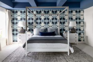
We love incorporating unique details into our client projects and this interior is full of them. First, we added a handmade wallpaper to serve as the focal point of the room and instantly draw guests in. We hand-selected a blue from the wallpaper to then paint on the ceiling for added intrigue.
After taking a closer look inside, guests may notice unique detailing that sets our bed selection apart from any other. This dipped bed has it’s natural wood exposed at the top, while the bottom half is coated in white paint. Such a subtle, yet noteworthy detail!
Flanking the bed, we styled two large lamps on top of white, fluted dressers. By keeping the furniture neutral, we really allowed the accent wall and ceiling detail to shine! Talk about “no wrong side of the bed” in this primary bedroom.
A Masculine, Golf-Inspired Guest Bedroom
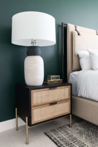
In the guest bedroom, our client asked we keep his love for golf at the heart of our design choices to complement the golf medals and photos he planned to display in the interior. This inspired us to add a green accent wall and a masculine grouping of furniture, including an upholstered bed with leather accenting. Adjacent to the bed, we styled a multi-material lamp on top of a beautiful nightstand with cane detailing, two shades of wood, and brass finishes, all atop a complementing black and ivory rug.
A Feminine, Pink Guest Bedroom
To satisfy our client’s request for pops of pink in the second guest bedroom, we applied a coat of light pink paint to our board and batten accent wall and a vintage, pink rug to further warm up the space. Keeping the furniture light and neutral to prevent overwhelm, we styled an upholstered bed flanked by two nightstands with brass and marble detailing. We also set up a small seating area in the corner of the room for guests to comfortably lounge in the space.
To finish off the interior, we opted for adding a fluted console table as opposed to a dresser. This our go-to cost-effective solution for spaces like guest bedrooms, where drawers likely won’t get much use.
A Lively & Fun Powder Bath Remodel
This powder bathroom was such a fun space to work on! We started by adding a grasscloth wallpaper comprised of white and brass detailing. Next to the accent wall, we hung a unique mirror with hair-on-hide and brass edging. Lastly, to further bring life into the space and incorporate more of the brass detailing, we added a brass planter above the lavatory.
Design Where Luxury Meets Livable
In the seating area in one of the bedrooms, we hung custom drapery and added this modern, brass iron chair with a soft-curved structure and cream-toned cushions. We love when luxury meets livable in details like this!
The Home Theater Room Design Everyone Will Enjoy
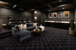
Our client’s movie room was already near completion at the start of our project. Because the accent wall, flooring, and back-row recliners were already installed, we wanted to make sure any finishing touches added to the space really made it feel unique and personal to our clients.
For a cozy feel, we added a custom sofa that complemented the blue from the flooring and a few cacti near the movie screen. For functionality, we also added a coffee table and a few side tables. Above the pre-existing bar area, we hung movie posters highlighting some of our clients’ favorite films. Lastly, we added custom lighting to really give the space that iconic, movie theater feel.
Every Theater Needs a Bathroom
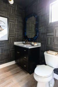
In the bathroom off the movie room, we aimed to mirror the details found throughout the movie room overall. First, we incorporated a blue mirror above the pre-existing vanity to tie in the blue from the movie room’s flooring and custom sofa. Then, we added dark wallpaper to remain consistent with the theater’s dark walls. Lastly, we tied in another movie poster to give one of our client’s favorite movies a moment to shine.
We hope you enjoyed exploring our Fanfol Project! Interested in working with us on your next project? Click here to send us a note about your project!
Read More: Project Reveal: Fanfol Pt 1 • Paradise Valley, AZ • Interior Design
Lauren Lerner is the founder of Living With Lolo, a nationally recognized Scottsdale interior designer and an Arizona licensed general contractor. She is celebrated for creating luxury homes that are warm, livable, and deeply personal, blending thoughtful design with seamless construction and curated furnishings. Recognized as one of Arizona’s top interior designers, Lauren has worked with celebrities, athletes, and executives across the country. Her work, known for its elevated yet inviting style, has been featured in multiple national publications. Guided by the belief that great design should feel as good as it looks, Lauren transforms houses into homes that truly reflect her clients’ lives.


